المعادن من أجمل وأكثر الأشياء سحرًا في العالم الطبيعي. تتشكل على مدى ملايين السنين، وتأتي في مجموعة لا نهاية لها من الأشكال والألوان. أنماطها الهندسية المميزة تجعلها تتناسب تمامًا مع مكعبات ليجو (LEGO®)، لذلك عندما رأى المعجبون مجموعة ليجو (LEGO® Ideas Mineral Collection)، سرعان ما صوتوا لها لتتجاوز عشرة آلاف صوت مطلوب.
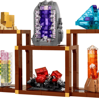
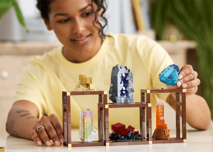
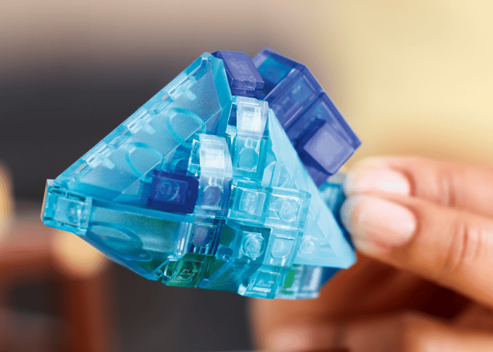
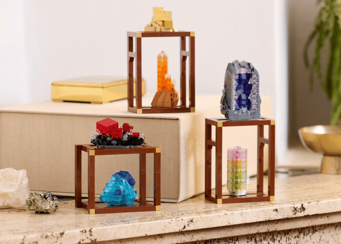
صُممت هذه المجموعة الجديدة وقُدمت لأول مرة إلى أفكار ليجو (LEGO® Ideas) بواسطة المصمم المعجب داريو ديل فرات، المعروف أيضًا باسم ddf72، وتتميز بنماذج مبنية من الطوب لفلز البيريت الذهبي، والأميثست الأرجواني، ورودوكروسيت الأحمر الوردي، والفلوريت الأزرق، والتورمالين البطيخي، والكوارتز اليوسفي، والتي يمكن عرضها معًا أو بشكل منفصل.
بينما نصدر المجموعة النهائية (لم نتمكن من مقاومة إطلاقها) ضمن مجموعة ليجو (LEGO® Ideas Mineral Collection)، تحدثنا إلى جوردان سكوت، الرائد الإبداعي في مجموعة ليجو (LEGO® Group)، لاستكشاف هذه المجموعة الجديدة المذهلة بشكل أعمق.